
Buyer Guide
Pantone Color Matching for Custom Hijab Production
Direct answer
Pantone references can make custom hijab color communication more precise, but a Pantone code alone does not guarantee an identical final fabric color. Fibre composition, fabric construction, dye or print method, base color, surface texture, finishing, lighting and production conditions can all change the result. A B2B buyer should build a controlled path from target reference to physical color sample, documented approval, production comparison and retained reorder record. The approved fabric or finished-product sample is usually a more practical bulk reference than a screen image alone.
Why Does Color Matching Matter in Private Label Hijab Production?
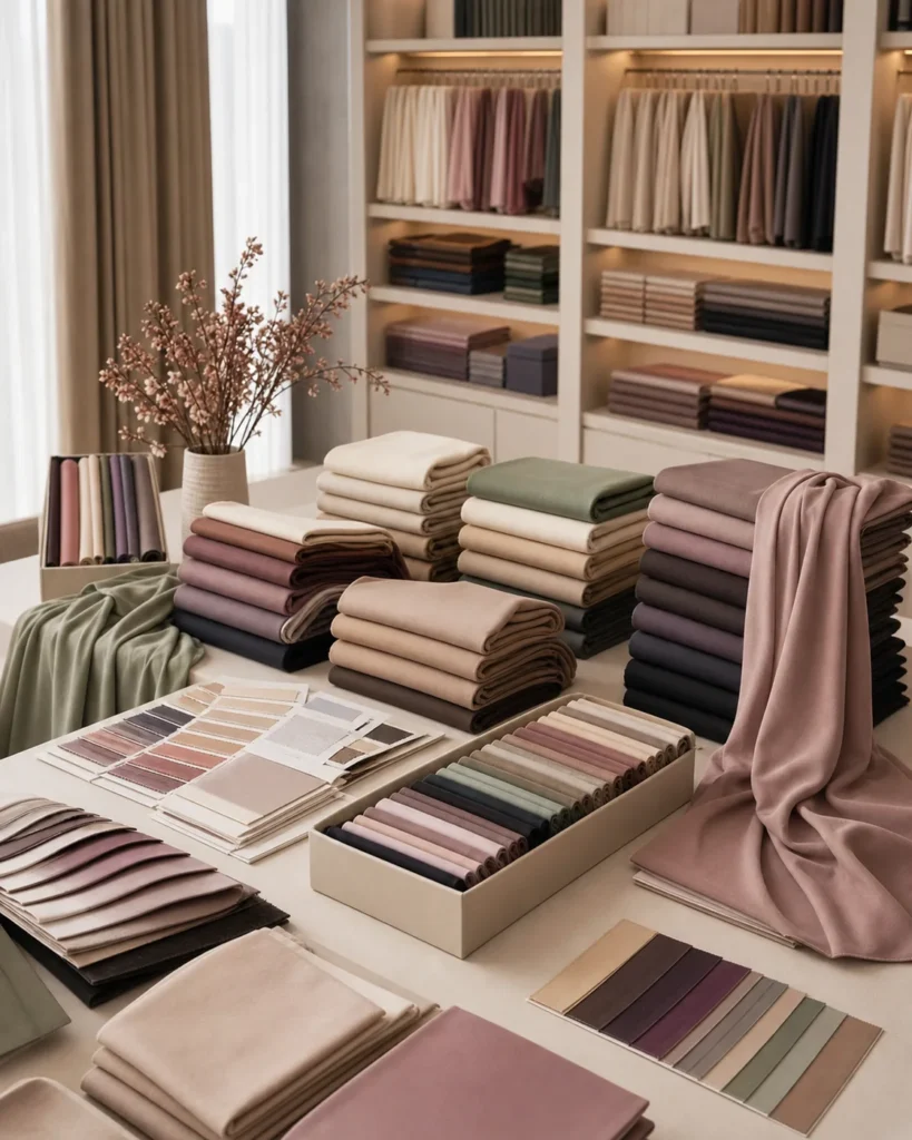
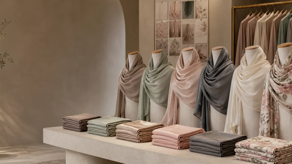
Color matching matters because color affects brand identity, collection consistency, product photography, SKU control, customer expectations and repeat orders. A shade is not only an aesthetic choice; it is part of the product definition that buyers, suppliers, photographers, warehouses and customers must identify consistently.
Core colors often remain in a range for several seasons and may need replenishment. Signature colors can become closely associated with the brand. Seasonal colors may have a shorter life but still require clear naming and approval. If a reorder differs visibly from the previous stock, the retailer may struggle to combine inventory, update photography or explain the variation.
The buyer implication is simple: give every commercially important shade a controlled identity. A color name such as “dusty rose” or “mocha” is useful for merchandising, but it is not a complete production reference. Pair the name with the fabric, product code, physical target, approval date and version.
What Is a Pantone Color Reference?
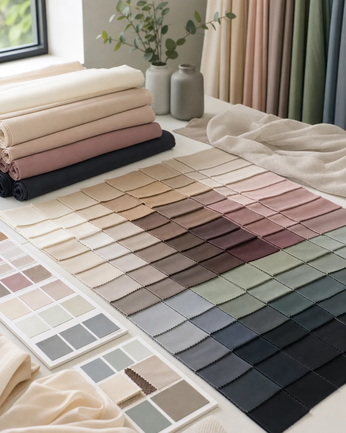
A Pantone reference is a numbered color target within a defined Pantone system. It helps designers, buyers and suppliers discuss a more specific intended color than a descriptive name or uncalibrated image. The system name and suffix matter because Pantone maintains different libraries for different materials and applications.
Pantone’s official guidance distinguishes the Pantone Matching System (PMS), used mainly for graphics, print and packaging, from the Fashion, Home + Interiors (FHI) system used for apparel, fabrics and soft goods. Within FHI, TCX represents color on cotton textile, while other formats may represent color on different substrates. A buyer should therefore send the complete reference, not only a number detached from its system and suffix.
A reference is still a target rather than proof of the final fabric result. A color shown on cotton, coated paper or screen will interact differently with modal, chiffon, jersey, cotton, silk or a satin-like surface. Use the reference to begin development, then approve the selected textile physically.
Pantone vs RGB vs CMYK: What Do Hijab Buyers Need to Know?
RGB, CMYK and Pantone describe color for different communication and production contexts. None should be assumed to represent every textile process directly. The supplier needs to know whether a value is a visual idea, an artwork instruction, a packaging standard or the target for a dyed or printed fabric.
| Color system | Typical use | Best use in hijab development | Main limitation |
|---|---|---|---|
| RGB / HEX | Screens, websites, apps and digital design | Share digital brand intent and organize online assets | Appearance changes with display, color space, brightness and ambient light |
| CMYK | Four-color process printing | May form part of a defined artwork or packaging print workflow | Output depends on profile, ink, press, substrate and print conditions; it does not define dyed fabric |
| Pantone PMS | Graphics, spot or screen printing and packaging contexts | Communicate a graphics or printed-color target where that system suits the process | A PMS shade on paper or ink is not automatically the same appearance on textile |
| Pantone FHI | Fashion, textiles, soft goods and related products | Provide a standardized apparel or textile color target | The final hue still depends on fibre, construction, finish and process |
| Physical fabric swatch | Material-specific visual and tactile reference | Show the desired result on a relevant surface | Can age, fade, soil or become unavailable; must be identified and stored |
| Approved sample | Product-specific production reference | Control the chosen fabric, color and finish together | Does not promise zero variation; approval conditions and version must be recorded |
Adobe’s color-model guidance explains that RGB represents emitted screen light while CMYK is a subtractive process-ink model, and that device color spaces have different gamuts. Pantone’s system overview explains the distinction between graphics and FHI applications. For a hijab order, use the system relevant to the actual item and retain a physical textile approval.
Why Can’t Screen Colors Be the Final Production Standard?
A screen image cannot be the sole final standard because phones and monitors reproduce color differently. Display technology, profile, brightness, contrast, night mode, calibration, camera processing, image compression and ambient lighting all affect what the viewer sees.
A WhatsApp photo, screenshot, social-media post or website swatch can communicate direction quickly. It can help a supplier understand whether the buyer wants a warm taupe, muted olive or vivid magenta. It cannot by itself control bulk textile color. Even two people opening the same file may see different results.
Send the original digital values and file where available, but label them as digital references. Add the complete Pantone or other physical target when relevant. Complete the decision with a physical fabric, print or finished sample viewed under agreed lighting.
Why Should Buyers Choose the Fabric Before Finalizing the Color?
The fabric should be selected before final color approval because the same target can look different across fibres, constructions and finishes. Surface reflection, texture, opacity, base color and dye or print interaction all change perceived hue, depth and saturation.
A matte modal may make a dark neutral look soft and muted. A sheer chiffon can let the background and number of layers influence the shade. Stretching jersey can change density and apparent depth. Silk or a satin-like surface can reflect highlights that make one area look lighter than another. These examples are visual tendencies, not guaranteed results for every fabric.
If the fabric remains undecided, first compare hijab fabric families. Detailed guides explain how modal weight and opacity, chiffon construction and jersey stretch and weight affect the physical product. Lock the material direction before treating a color sample as final.
How Does Fabric Composition Change Color Appearance?
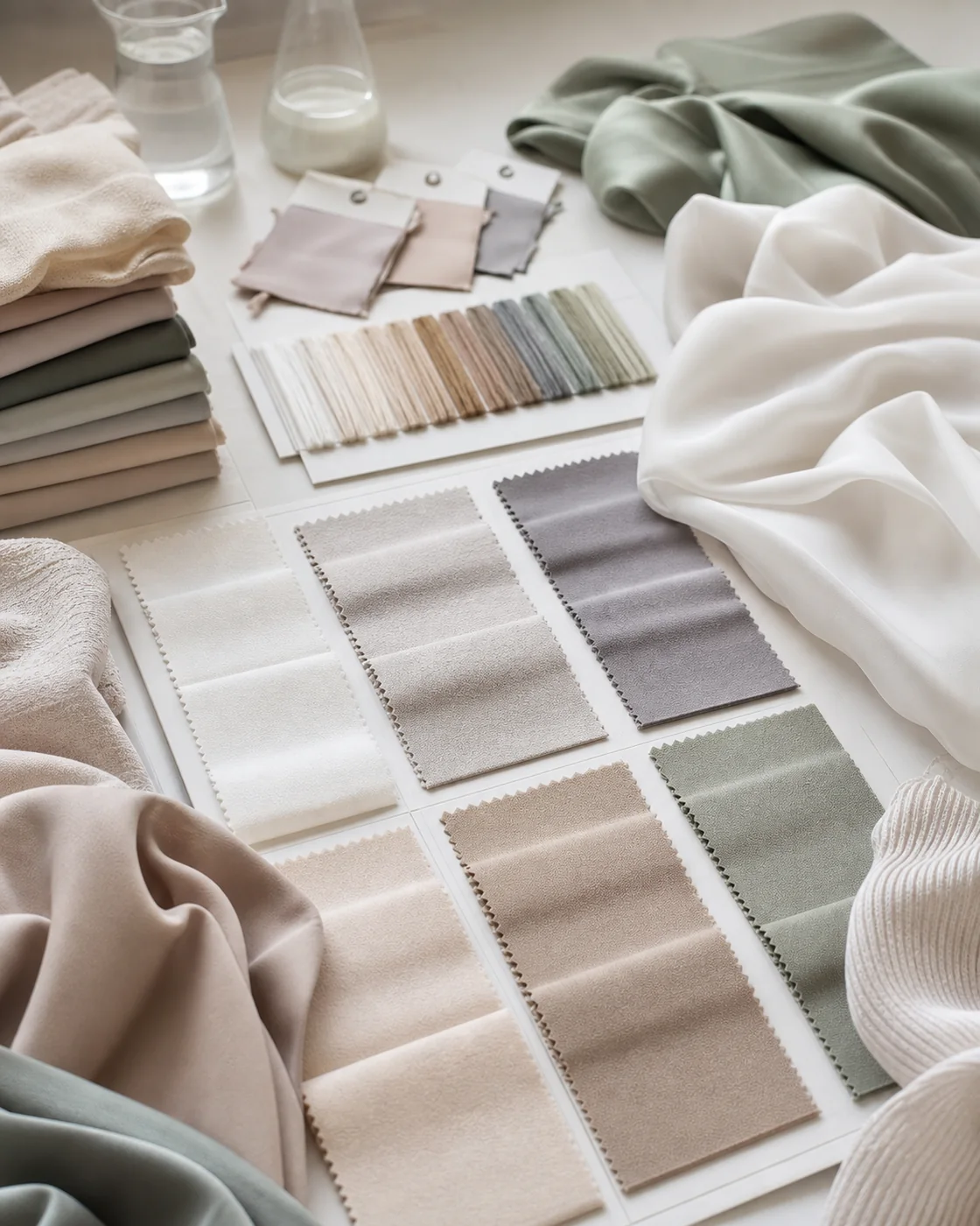
Fibre composition can affect how colorants interact with the textile and how the surface reflects light. Natural, regenerated-cellulose and synthetic fibres can require different dye classes, preparation, temperatures or print systems. The resulting depth, saturation and uniformity also depend on yarn, construction and finishing.
This does not mean one fibre is always brighter, duller or easier to match. A specific cotton, viscose, polyester, modal, silk or blended construction must be tested in its intended process. In a blend, different components may respond differently, and the manufacturer’s feasible method must be confirmed.
Buyers should record the complete declared composition with the approved color. Changing the fibre percentages or base fabric after approval may require a new color development and sample review.
How Do Texture and Sheen Affect Perceived Color?
Texture and sheen change how light reaches the eye, so one color can appear different on smooth, matte, crepe, ribbed, brushed or satin-like surfaces. A glossy surface creates highlights and darker viewing angles; a matte surface scatters light more diffusely; a pronounced texture creates small areas of light and shadow.
| Surface direction | Possible visual effect | Buyer review |
|---|---|---|
| Smooth matte | Relatively even, low-shine appearance | Check undertone, depth and surface uniformity |
| Crepe or grainy | Micro-shadows may alter perceived depth | View close and at normal retail distance |
| Ribbed jersey | Ridges can create directional light and shadow | Rotate the sample and review stretched and relaxed |
| Silk or satin-like sheen | Highlights and viewing angle can shift perceived lightness | Inspect several angles under controlled light |
| Sheer construction | Background and layering affect the visible shade | View one layer, folded layers and intended styling context |
Approve the color on the final or representative textile. A paper chip can guide the target, but it cannot reproduce every surface effect.
What Is a Lab Dip, Strike-Off or Color Sample?
A lab dip is generally a small physical color development used to evaluate a dyed shade before larger production. A strike-off is commonly a small printed trial used to review print colors, pattern and process. A finished sample combines the selected fabric, color, dimensions and finishing in a product closer to the final order.
Manufacturer terminology and workflows vary. Some projects may use a fabric swatch or sample rather than a step explicitly called a lab dip. Stock colors, custom dyeing, digital printing and other processes do not necessarily follow the same sequence. Buyers should ask what physical approval stage applies to the proposed fabric and process rather than assuming every supplier uses identical terms.
| Approval item | Usually helps evaluate | Does not necessarily confirm |
|---|---|---|
| Lab dip | Dyed color direction on a relevant material | Finished dimensions, sewing, labels and packaging |
| Strike-off | Printed color, artwork scale, repeat and interaction with the base | The complete finished scarf unless made as one |
| Fabric swatch | Color, surface, hand and construction direction | Full-size drape and edge behavior |
| Finished sample | Fabric, color, size, edge, label and presentation together | Zero variation across all future lots |
How Should a Buyer Submit a Color Request?
A useful color request connects one shade to one product and material. It separates the customer-facing name from the production target and tells the supplier how the buyer intends to approve it.
| Color request field | What to provide | Why it matters |
|---|---|---|
| Product code | Unique SKU and revision | Prevents the shade being assigned to the wrong style |
| Fabric | Composition, construction or approved reference | Color appearance is material-specific |
| Commercial color name | Customer-facing name such as Sand 01 | Supports merchandising and inventory |
| Pantone reference | Complete code, system and suffix where relevant | Creates a more specific target |
| Physical reference | Swatch, sample or other identified standard | Shows the intended appearance physically |
| Digital reference | Original RGB/HEX values or artwork file | Connects web and design assets without treating them as final proof |
| Product use | Core, signature, seasonal, printed or reorder | Clarifies approval priority and record retention |
| Quantity | Total and split by product/color | Allows feasibility and MOQ discussion |
| Finish | Matte, textured, satin-like or other approved direction | Surface changes perceived color |
| Reorder reference | Prior approved sample, PO or lot reference where available | Connects the new production target to history |
Do not send a screenshot with “match this exactly” as the whole brief. State which reference controls if the screen, Pantone and physical swatch do not look identical.
How Should a Hijab Color Sample Be Reviewed?
A color sample should be compared side by side with the agreed physical target under defined lighting and on the intended fabric. Review hue, lightness or value, saturation, undertone, uniformity and surface effect rather than relying on a quick “close enough” impression.
- Confirm the product, fabric, color code and sample revision before judging.
- Allow the sample and reference to lie flat and view them against a neutral surrounding where practical.
- Compare in suitable natural daylight and a consistent neutral indoor light.
- Review side by side, not from memory or separate photos.
- Inspect the fabric flat, folded and unfolded.
- Check one layer and multiple layers where transparency affects appearance.
- Rotate shiny or textured fabric to see angle-dependent change.
- Inspect color uniformity across the sample and relevant pieces.
- Record approval, rejection or requested adjustment in clear language.
- Retain the approved physical reference with date and version.
If digital photographs are used to communicate comments, include them as supporting evidence, not as the only approval standard.
What Is Metamerism and Why Can Colors Change Under Different Light?
Metamerism occurs when two color samples appear to match under one light source but differ under another. Their spectral reflectance can be different even when the visual result looks close in a particular condition. Changes between daylight, store lighting, office light and photography can therefore reveal a mismatch.
Buyers do not need to turn every approval into advanced color science. They do need to identify important viewing conditions. If a signature hijab shade must coordinate with packaging, garments or an existing collection, examine those items together under more than one relevant light source.
Datacolor’s technical introduction to metamerism explains the principle. The practical action is to use stable references, controlled comparisons and documented lighting rather than approving from memory.
Should Buyers Expect a 100% Exact Pantone Match?
Not necessarily. Pantone provides a clearer target, but textile appearance is affected by substrate, fibre, construction, colorant system, texture, finish and production conditions. Some target colors may also be more or less feasible on a particular material and process.
Pantone itself maintains different systems because material and application affect achievable appearance. For textile product development, its FHI system is the relevant starting family; a PMS graphics color should not automatically be treated as a dyed-fabric formula.
Use the Pantone reference to communicate intent. Use an approved physical fabric or finished sample to define the accepted result for that product. Do not promise customers a mathematically identical color across screen, paper, packaging, several fabrics and every production lot unless a qualified process has established and documented those requirements.
What Should Buyers Define as Color Tolerance?
Color tolerance defines how variation will be evaluated and accepted. There is no universal tolerance number for every hijab, fibre, shade or buyer. The appropriate control depends on brand importance, material, process, measurement method, visual assessment and contract requirements.
Before production, agree on:
- the controlling physical and/or numerical target;
- the fabric, construction and finish to which it applies;
- the sample approval process and responsible party;
- the visual comparison lighting and surrounding;
- whether instrument measurement is required;
- how bulk pieces and different lots will be sampled;
- the reference retained for reorders;
- what happens if a result falls outside the agreed acceptance.
Delta E (ΔE) is one way to quantify color difference within a defined color-measurement system, but the formula, instrument conditions and acceptance threshold must be specified by the project. This article does not set a NoorSilk ΔE limit or claim a particular measurement process.
How Does Color Matching Differ for Solid and Printed Hijabs?
A solid dyed hijab usually treats the fabric shade as the main color target. A printed hijab must control both the base fabric and the printed artwork, including multiple colors, profiles, ink or dye interaction, repeat, scale and placement. The approval items may therefore differ.
| Control point | Solid color | Printed color |
|---|---|---|
| Base material | Fibre, construction and preparation influence the dyed shade | Base color and surface influence all printed colors |
| Color input | Pantone/FHI, swatch or approved dyed sample where relevant | Artwork values, spot references and physical print target where relevant |
| Physical proof | Lab dip, swatch or finished sample depending on workflow | Strike-off or printed sample depending on workflow |
| Additional variables | Uniformity, finish, lot and seam/edge appearance | Repeat, scale, registration, detail, hand feel and placement |
| Final reference | Approved fabric or finished product sample | Approved printed fabric or finished product plus artwork version |
Use the separate guide to prepare custom printed hijab artwork. It addresses file format, repeat, scale and print-specific color control without duplicating this article’s solid-color approval focus.
Why Can Light Colors Require More Careful Review?
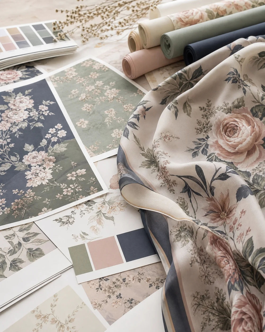
Light colors can require more careful visual review because surrounding colors, background, fabric transparency, layering and illumination may influence perception. A pale beige placed on white, grey or a dark table can seem to change warmth or depth. A sheer light chiffon can also reveal more of the background than a dense dark fabric.
This does not mean light colors are always harder to manufacture. It means the approval context must be controlled. Compare on the intended base fabric, against a neutral surrounding, in relevant lighting and in the number of layers expected during use. Check both shade and opacity.
How Should Core Colors Be Approved?
Core colors should have durable records because they may remain in the collection and be reordered repeatedly. Treat the approved sample as a master reference linked to a product-specific color record.
| Master color field | Example of what to record |
|---|---|
| Product code | The exact hijab style or fabric family |
| Commercial name | The customer-facing shade name |
| Pantone/physical target | Full system code and identified swatch where used |
| Fabric | Composition, construction, weight and finish reference |
| Approved sample | Sample ID and storage location |
| Approval | Date, approver and comments |
| Version | Current approved revision and superseded versions |
| Production history | Previous PO or lot reference where applicable |
Do not allow one approved “black” or “ivory” to become the uncontrolled standard for every fabric. The same commercial name can require separate physical approvals on modal, chiffon and jersey.
How Should Seasonal Colors Be Managed?
Seasonal colors can be more experimental, but they still need a SKU, clear name, sample approval and production record. Without those controls, the same shade name can represent different colors across launches, causing inventory and photography confusion.
Record the season or capsule, product, fabric and version. Decide whether the shade will be retired, repeated or promoted to the core range after sales evidence. This creates a clean foundation for a later collection-planning decision between core and seasonal colors.
Why Can Color Vary Between Production Batches?
Color can vary between batches because raw material, fibre lot, dye lot, base-fabric preparation, process conditions and finishing can change. Different fabric lots may also reflect light differently even when the nominal color target is unchanged.
The realistic objective is controlled consistency against agreed references and acceptance methods, not an unsupported promise of zero color difference. For a critical shade, ask how the supplier proposes to compare production with the approved reference and how representative bulk samples will be reviewed.
How Should Buyers Manage Color for Reorders?
A reorder should refer back to the previous approved color record rather than begin with a color name or screenshot. Send the current product code, fabric specification, color code, approved sample and previous production reference where available.
| Reorder record | Purpose |
|---|---|
| SKU and product revision | Confirms which construction is being repeated |
| Fabric reference and composition | Prevents an unapproved base change |
| Color name and code | Connects merchandising and production identities |
| Complete Pantone reference | Restates the target system where relevant |
| Approved physical sample | Provides the material-specific comparison point |
| Previous PO or lot | Links production history when applicable |
| Photo reference | Supports records but does not replace the physical standard |
| Revision status | Shows whether any change has been authorized |
| New approval decision | Records whether the reorder sample or lot is accepted |
Store physical standards away from unnecessary light, heat, dirt and handling, identify them clearly and retire obsolete versions. If the fabric, finish or process changes, decide whether a new color approval is required.
Common Color-Matching Mistakes in Custom Hijab Production
- Approving from a phone: screens and ambient light vary.
- Sending only a screenshot: it lacks a stable physical and system reference.
- Using only a color name: “nude,” “taupe” and “rose” cover many shades.
- Changing fabric after color approval: the new surface may need fresh development.
- Ignoring texture and sheen: they change perceived lightness and depth.
- Checking one light source: metamerism or surface reflection may become visible elsewhere.
- Approving printed colors without a physical print: artwork and base fabric can interact.
- Losing version control: supplier and buyer may use different samples.
- Assuming Pantone guarantees identity: it is a target within a defined system, not a universal textile formula.
- Reordering without the prior reference: the new request loses production history.
- Inventing a tolerance after production: acceptance should be agreed before bulk work.
Pantone Color-Matching Checklist for Hijab Buyers
- Confirm the hijab product and final fabric direction.
- Assign a unique product and color code.
- Define the commercial color name.
- Provide the complete Pantone reference where relevant.
- Identify the Pantone system and suffix, not only the number.
- Provide an identified physical reference when available.
- Label RGB, HEX, CMYK, screenshots and photos as supporting digital references.
- Confirm whether the product is solid dyed, printed or another process.
- Ask which physical color-sample stage applies.
- Compare the sample side by side under agreed lighting.
- Review hue, lightness, saturation, undertone and surface effect.
- Check single-layer and layered appearance where relevant.
- Confirm the shade on the intended final fabric and finish.
- Record approval, sample code, date and revision.
- Lock the approved reference before bulk production.
- Retain the physical and written record for reorders.
How Should Color Requirements Be Added to a Hijab Specification Sheet?
The color section of a specification sheet should link the design target to the product, material, sample and reorder record. It should also state which reference controls if several inputs differ.
| Specification field | What to record |
|---|---|
| Product code | Unique hijab SKU and revision |
| Fabric | Approved construction, supplier/reference code and weight where relevant |
| Composition | Confirmed fibre percentages |
| Color name and code | Commercial name plus controlled internal code |
| Pantone target | Complete number, system and suffix where used |
| Physical swatch | ID, source, date and storage reference |
| Digital or print references | Artwork version, RGB/HEX/CMYK or spot values where applicable |
| Process | Solid dye, print or other confirmed development route |
| Finish | Matte, textured, shiny or other approved direction |
| Evaluation | Lighting, visual method and any agreed instrument method |
| Approved sample | Sample code, date, approver and comments |
| Tolerance | Project-specific acceptance method without assuming a universal number |
| Reorder reference | Prior approval and PO/lot where applicable |
| Revision | Current version and change history |
The guide to private-label hijab manufacturing shows how the product brief and specification connect to samples, approvals, production, quality review and packaging.
From Color Approval to a Custom Hijab Project
When the buyer has confirmed fabric, color reference, Pantone system where relevant, physical approval method, quantity, branding and packaging, the project can move to a sample or quotation discussion. Send the color matrix and specification rather than a disconnected list of shade names.
NoorSilk’s OEM and private-label hijab manufacturing page presents the commercial route for custom colors, products, labels and packaging. Buyers developing a first range can also use the guide on planning a hijab brand to connect color choices with assortment, MOQ and SKU control.
The purpose of Pantone color matching for hijabs is not to turn one code into an unconditional guarantee. It is to create a clearer chain of communication: target, fabric, physical sample, approval, production reference and reorder record.
Turn the color idea into a controlled brief
Ready to discuss custom colors for a hijab collection?
Share the product, fabric, color names and references, quantity, approval needs, branding and packaging.
Request a Custom Color Sample or QuoteDiscuss Color Requirements on WhatsApp